Rebrand
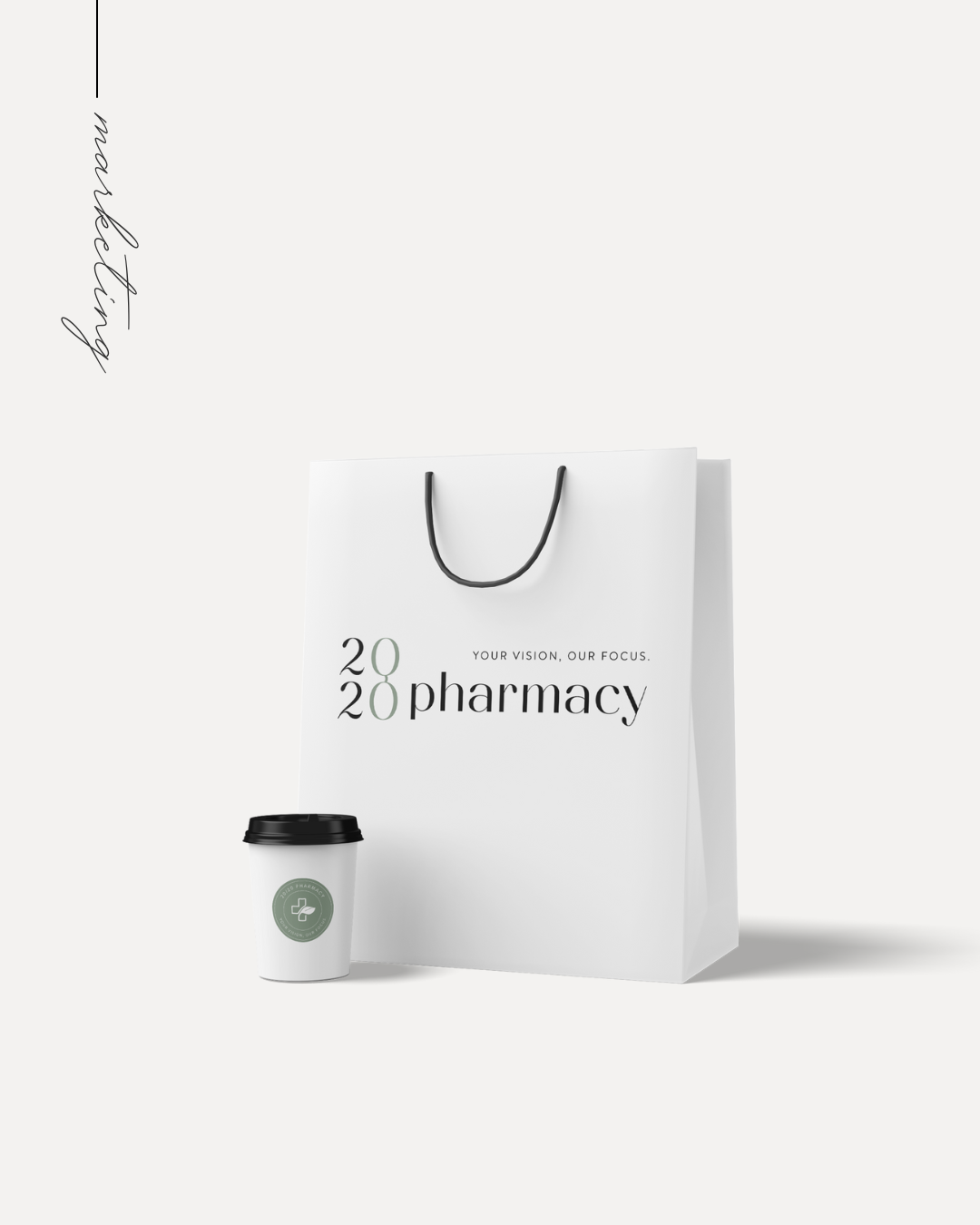
20/20 Pharmacy
bespoke / approachable / modern / minimalist / elegant
This downtown Calgary, Alberta Pharmacy was undertaking a massive redesign and renovation of their space which was the perfect opportunity for a complete rebrand. Overall, the brand concept is simplistic and fresh, yet elegant. The palette feels modern and sophisticated but also has a natural feel.
The core representation of the design is a modern serif font that has a unique feel unconventional to what is usually found within this niche. This font allowed for timelessness, easy legibility and versatility without feeling too feminine. The primary font coupled with a complimentary casual sans serif font adds approachability. A unique and subtle detail on the stacked 20/20 allowing for the 0's to be connected representing eye glasses and vision.
The primary custom illustrated graphic element is a medical cross, both in line art and full colour, typical of the niche, however, feeling more modernized and organic, with the addition of leaves within the illustration. The illustrations are versatile and work very well as image overlays, icons and other marketing items giving the brand a very unique feel. The logo itself is superbly versatile and many alternatives and submarks were included in the asset library. Playing on the circle and oval shapes also brings connection to eyes / vision / glasses. In addition one submark, had a subtle play on the eye chart.