Rebrand
Michael Jordan
established / timeless / modern / honest / approachable / elite
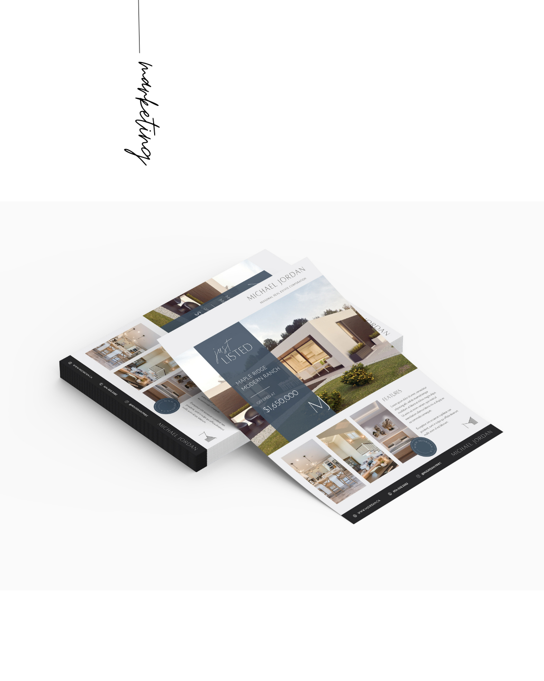
After being in the real estate industry since 1995, Michael was long overdue for a professional and sophsticated brand that better represented he and his UA and wife Coby’s personality and style. The brand has a well established, timeless and modern appeal but sstill feels approachable and honest.
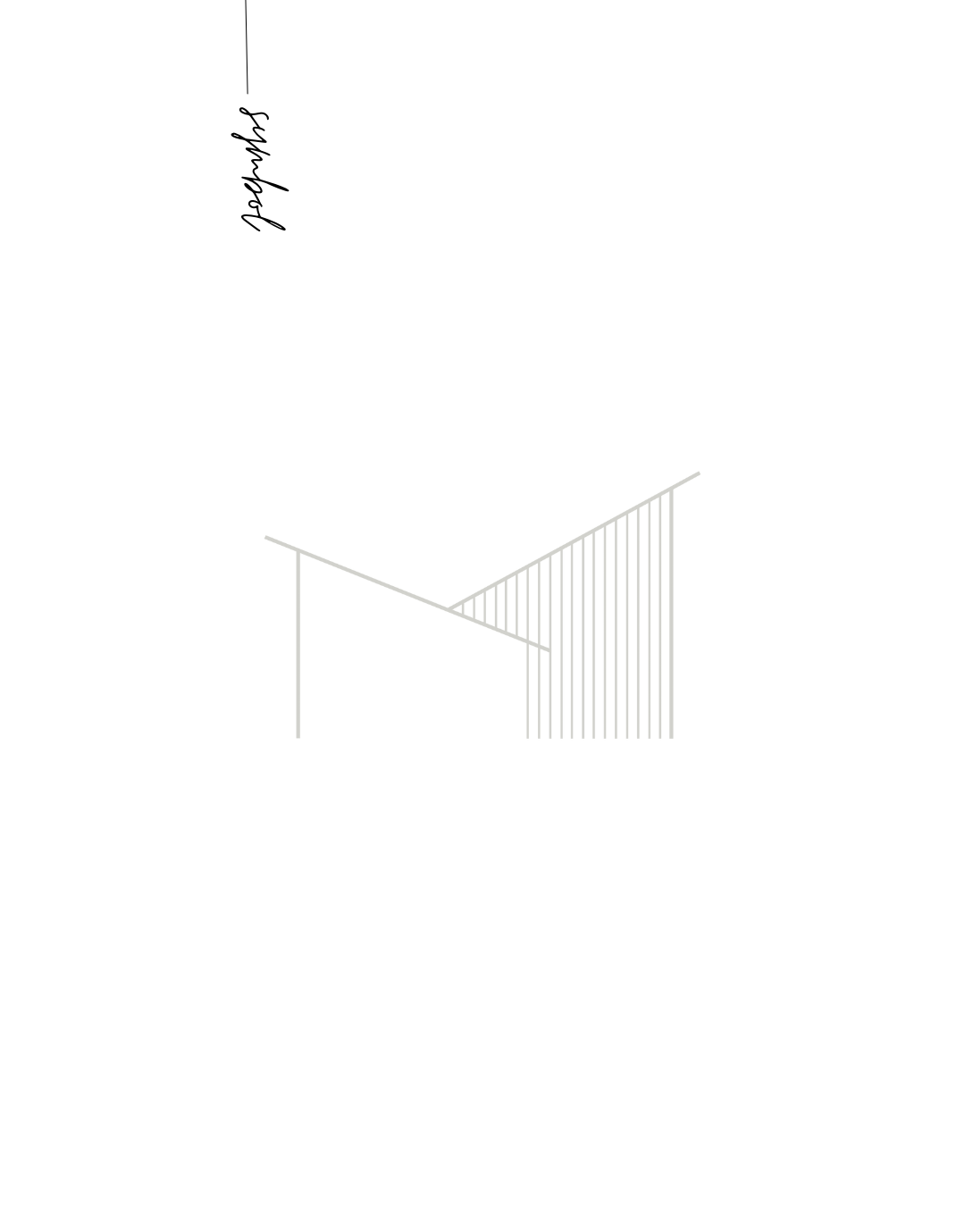
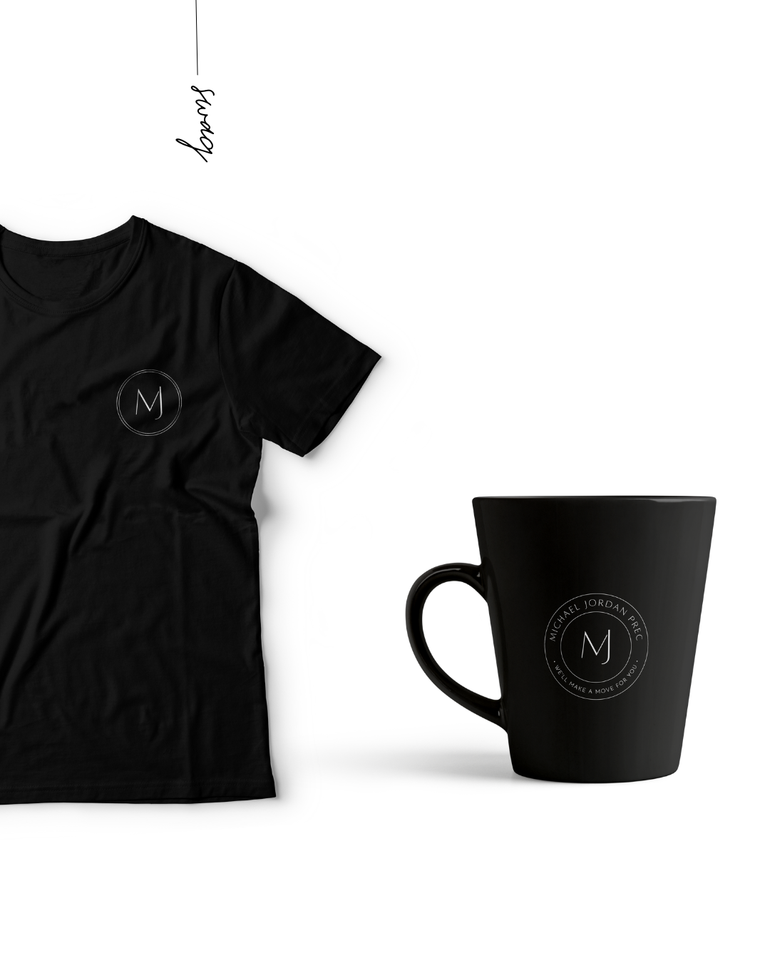
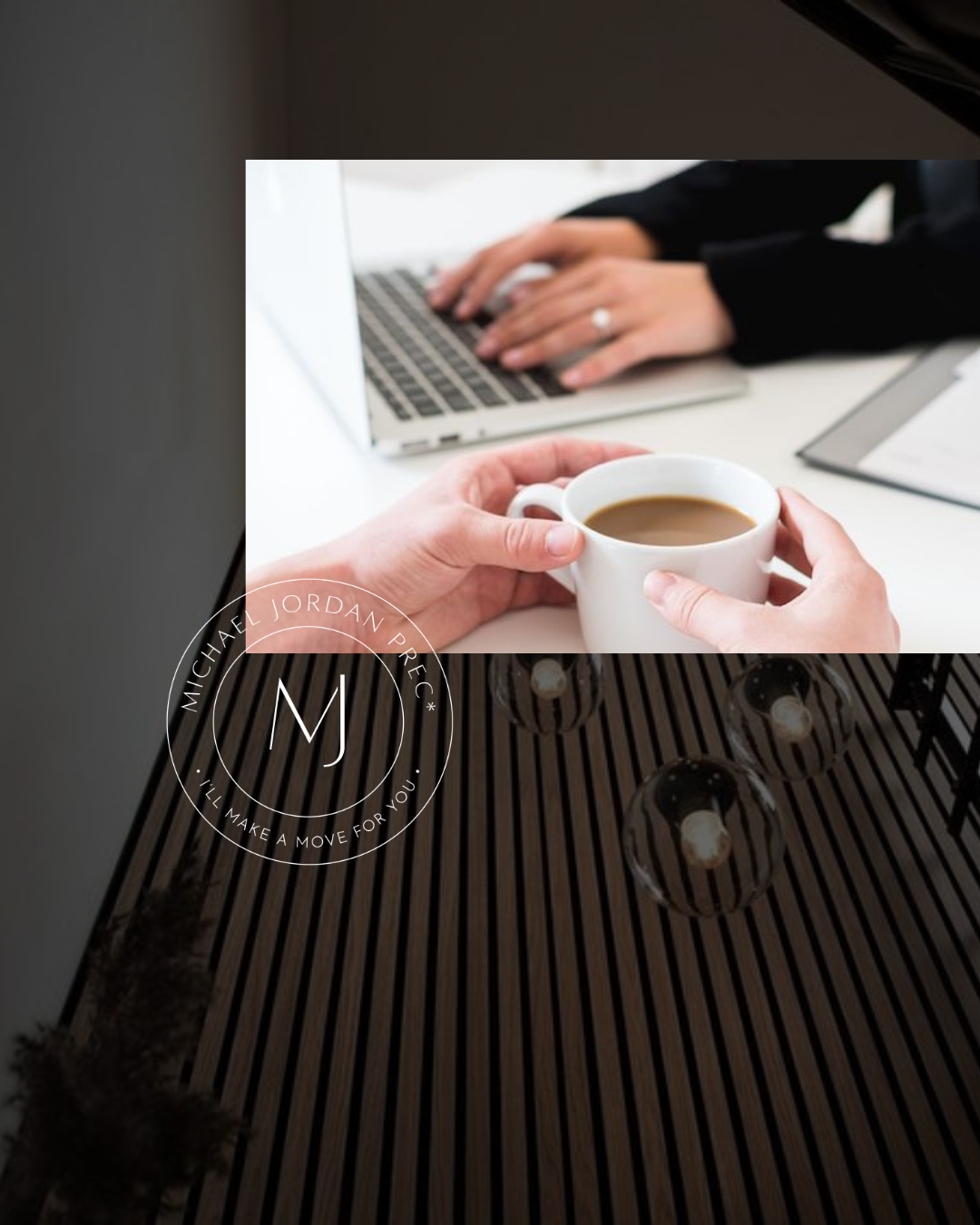
The core representation of the design is a modern sans serif font that has an architectural feel. The primary font coupled with a complimentary casual script adds friendliness and femininity. The primary custom illustrated graphic element is a modern line art structure. The inspiration for this illustration is a slat wood wall featured in their condo, as well as the pitch of the roof of their grilling area out at their cottage - their happy place. The basis for the illustration, of course, is the M character. A secondary custom illustrated graphic of a Dogwood leaf was introduced which also brought in a natural and organic element and a nod to their location in BC and their forested happy place.